Um ótimo solução de análise incorporada pode aprimorar a tomada de decisões orientada por dados. e levar a melhores resultados com painéis poderosos e de alto impacto.
Com frequência, infelizmente, dados comerciais valiosos são obscurecidos por uma apresentação ruim. Painéis sobrecarregados com informações confusas e enganosas impedem que os usuários extraiam insights acionáveis.
Painéis e análises são úteis apenas quando os usuários podem entendê-los.
É aí que análise incorporada as ferramentas se tornam úteis – elas permitem que você transforme seus dados em uma história com ótimos elementos visuais de UI e UX.
Neste artigo, compartilharemos os princípios básicos para criar painéis de UI/UX de alto impacto com análises incorporadas para melhorar o processo de tomada de decisões do seu usuário final, visando a máxima lucratividade.
Qual é a diferença entre UI/UX?
Em resumo, a UI (interface do usuário) é a série de páginas, telas e elementos visuais que permitem que o usuário interaja diretamente com um produto ou serviço. Por outro lado, a UX (experiência do usuário) é a experiência completa de um usuário ao interagir com todos os aspectos do produto ou serviço de uma empresa.
A UI é tudo que um usuário acessa e interage ao usar seu produto ou serviço, incluindo menus, botões, formulários, ícones, imagens, tipografia, campos de pesquisa, etc.
A UX abrange todos os pequenos detalhes e várias interfaces de usuário que se unem para formar uma experiência de usuário perfeita para os usuários finais que interagem com o produto ou serviço. Esses detalhes incluem usabilidade, função, facilidade de navegação, etc.
Apesar das pequenas diferenças entre UI e UX","1705", ambos os elementos são cruciais no desenvolvimento de produtos e trabalham em estreita colaboração para determinar como um produto será visualizado e funcionará – com um influenciando o outro. Não há UI sem UX e vice-versa., both elements are crucial in product development and work closely together to determine how a product will look and function – with one influencing the other. There is no UI without UX and vice versa.
Imagine que você criou o site mais bonito, mas depois percebe que as pessoas acham difícil navegar e não conseguem encontrar o que estão procurando. Independentemente de quão bonita seja a UI, sem uma boa UX, os usuários ficarão frustrados e nunca mais retornarão ao seu site.
O que é UI de painel?
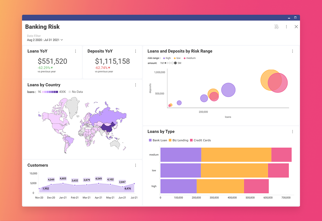
Os painéis são ferramentas poderosas para influenciar os processos de tomada de decisão dos usuários. Eles ajudam os usuários a obter informações sobre seus KPIs e métricas mais importantes e exibem dados relevantes e acionáveis. Um painel de alto impacto é possível e pode ser criado por meio do design da UI do painel.
Se você projetar um painel de UI moderno","1710", você fornecerá aos seus usuários os dados de que precisam, em um formato fácil de escanear e entender. Aqui estão alguns outros benefícios importantes de uma ótima UI de painel:, you will provide your users with the data they need, in an easy-to-scan and understand format. Here are some other key benefits of a great dashboard UI:
- Eles comunicam insights de dados rapidamente
- Eles exibem dados de forma clara e eficiente
- Eles exibem tendências e mudanças nos dados ao longo do tempo
- Todas as informações essenciais são acessíveis imediatamente
- Todas as informações essenciais são exibidas em uma única tela
- Eles fornecem oportunidades para aprofundar os dados para obter mais informações
- Gráficos, tabelas e outros elementos visuais são exibidos em uma visualização minimizada, com a possibilidade de exibir mais detalhes em uma janela modal com mais informações
- Eles permitem que os usuários filtrem e personalizem dados usando rótulos, categorias e KPIs
- Eles permitem que os usuários naveguem facilmente para outras áreas do aplicativo que exigem sua atenção
Princípios orientadores de um ótimo design de UI/UX de painel
Um painel de UI de alto impacto pode ser um desafio de design. Especialmente se você não souber por onde começar. Mas seguir as melhores práticas de design de painel que listamos abaixo torna o objetivo alcançável. Para garantir que você projete uma UI moderna para seu painel, siga estes 12 princípios de UI/UX:
1. Defina o propósito do painel
O painel tem um propósito específico a cumprir, e se você errar isso desde o início, mesmo que siga todas as outras melhores práticas de design de painel, o resultado será sem sentido.
Existem 4 categorias de painéis para escolher:
- Operacional– para business intelligence fins, o objetivo do painel operacional é monitorar, medir e gerenciar operações em uma escala de tempo mais imediata ou mais curta.
- Estratégico– usado para estratégias de negócios de longo prazo para analisar as informações mais essenciais com base nas tendências.
- Tático – usado para ajudar a formular estratégias para o crescimento em círculos de gerenciamento.
- Analítico – para exibir grandes quantidades de dados abrangentes para analistas e outros usuários de negócios, ajudando-os a criar insights que ajudam a empresa a crescer.
2. Entenda seus usuários
Os painéis comunicam histórias de dados; a regra de ouro da comunicação é conhecer seu público. Para seguir os princípios do design de painel de alto impacto, você precisa identificar seu público-alvo – as pessoas que lerão as informações que você apresenta no painel.
Você comunicará os dados do painel de forma diferente para um usuário técnico do que para um usuário de negócios ou se estiver fazendo uma apresentação de vendas para um cliente ou uma apresentação para os executivos de sua empresa.
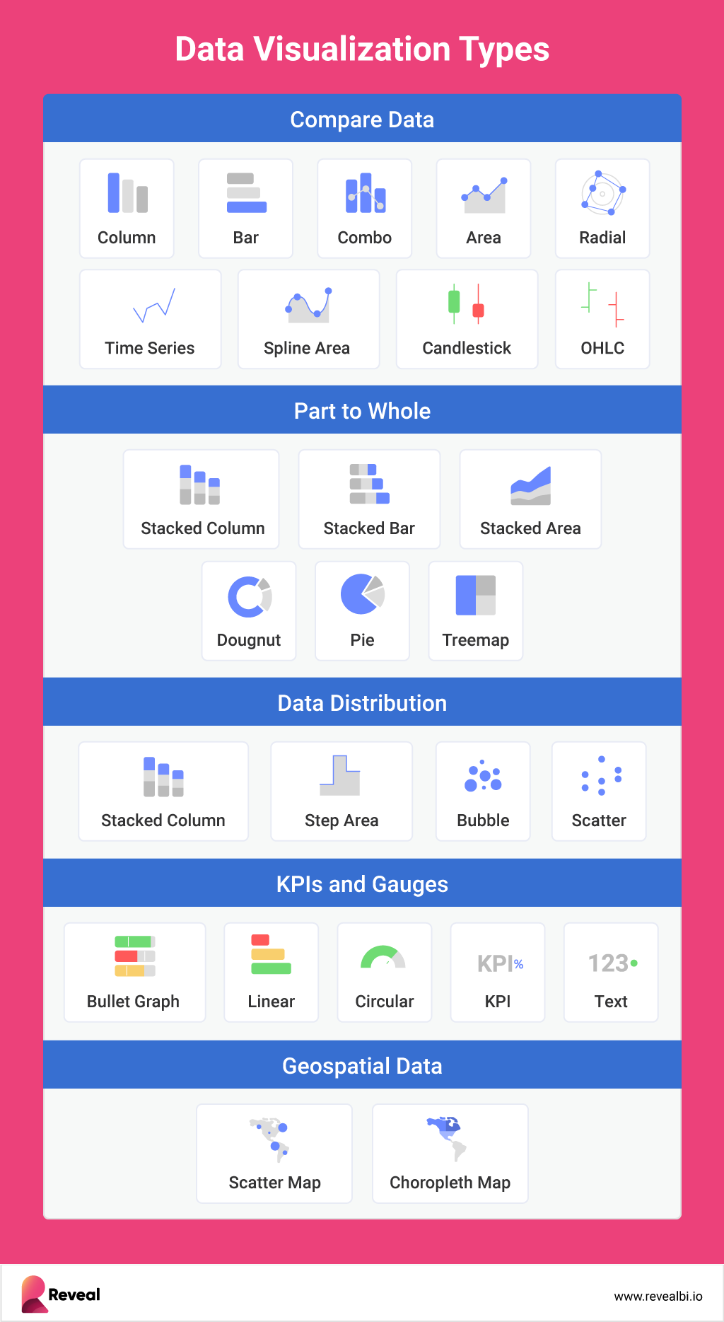
3. Escolha os tipos de gráficos corretos
Um dos maiores desafios da UI de painel eficaz é escolher o tipo de gráfico certo para visualizar os dados para o público que você já identificou. Existem infinitos tipos de gráficos para escolher, e cada um tem atributos exclusivos que podem ajudá-lo a transmitir melhor sua mensagem ou história de dados.
E, embora seus dados possam funcionar com vários gráficos, cabe a você, como designer de UI de painel, garantir que você selecione o tipo de gráfico que torna os dados claros e concisos para seu público.
Ao escolher um tipo de gráfico, pense nessas perguntas-chave:
- Qual é o ponto principal que você deseja comunicar com seu gráfico?
- Você deseja comparar variáveis?
- Você precisa entender a distribuição dos dados?
- Existem tendências possíveis que você precisa analisar?
Escolha o ponto que você deseja destacar e selecione um tipo de gráfico que seja ideal.
4. Exiba os dados essenciais
Embora isso possa parecer óbvio, não é – já vimos muitos exemplos de painéis cheios de dados e elementos desnecessários e que distraem, não é?
O desafio aqui é encontrar o equilíbrio entre os dados que você PODE exibir em um painel e os dados que você DEVE exibir nele. Sabemos que pode ser tentador adicionar todos os gráficos e filtros possíveis ao seu painel, mas isso o tornará eficaz e de alto impacto – não!
Facilite para seus usuários encontrarem mais informações, fornecendo-lhes acesso para se aprofundar nos dados em outra área do seu produto.
5. Busque a simplicidade
Com base na lógica do nosso ponto anterior, os painéis não apenas precisam exibir os dados essenciais sem sobrecarregar os usuários, mas também precisam buscar a simplicidade.
Torne o design de UI/UX do seu painel intuitivo. Por exemplo, coloque a barra lateral no lado esquerdo da tela, onde os usuários esperariam encontrá-la.
Além disso, abordaremos isso em breve, mas não exagere nas cores, gráficos, efeitos, etc. Os painéis não precisam ser impressionantes ou incríveis – elesprecisam ser eficientes..
6. Apresente o Contexto
Um bom painel de controle de alto impacto também incluirá títulos e descrições descritivas para ajudar os usuários a entenderem rapidamente os dados e navegarem facilmente pelo painel.
Use títulos concisos e descritivos que forneçam aos usuários o motivo e a explicação para o seu gráfico. Mantenha o título do seu gráfico simples e direto, pois seus dados e visualização devem contar a essência da sua história. Seu título deve estar diretamente relacionado e apoiar o gráfico abaixo dele.
Além disso:
- Ordene seus dados alfabeticamentequando você estiver usando categorias em seu eixo x e precisar ajudar as pessoas a encontrarem o que estão procurando rapidamente.
- Ordene seus dados em ordem crescente quando precisar ajudar a contar a história do crescimento.
- Ordene seus dados emem ordem decrescente quando precisar comparar do maior para o menor.
7. Uso Adequado das Cores
As cores podem ajudá-lo a destacar o que é importante ou podem prejudicar seu painel. Mas, ao falar de cores, todos nós temos uma ampla gama de preconceitos em relação a diferentes cores. Por exemplo, o vermelho é comumente visto como um mau sinal, enquanto o verde é comumente visto como um bom sinal.
Naturalmente, ao projetar seu painel, você deve considerar isso e lembrar de manter os princípios básicos da psicologia do design em mente.
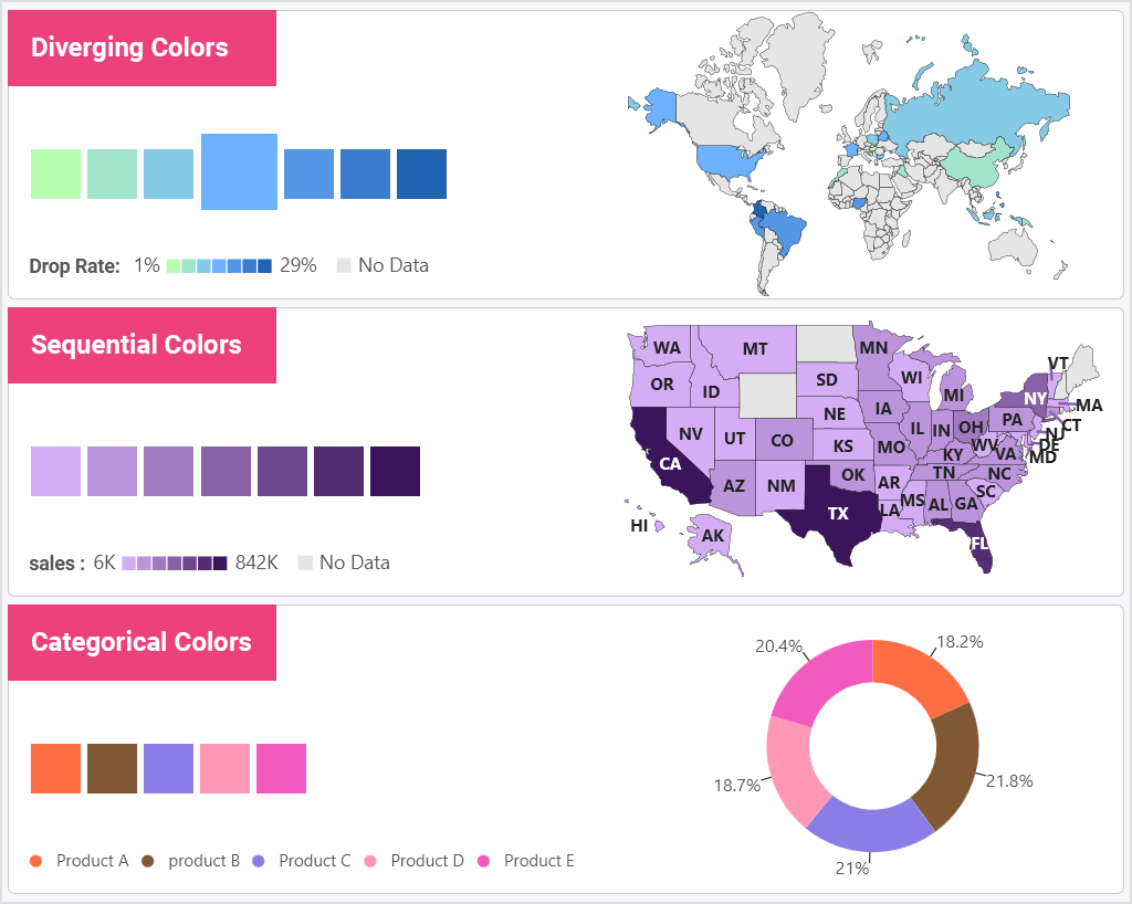
No entanto, para evitar confusão nos gráficos e desviar-se da sua história, existem três tipos de esquemas de cores que você pode usar em seus painéis: divergente, sequencial e categórico.
- Use esquemas de cores divergentes quando um valor central for compartilhado entre ambas as extremidades.
- Use cores sequenciais com valores numéricos ou ordenados.
- Use cores categóricas com variáveis distintas sem nenhuma ordem.
8. Destaque o que é Importante
Projete visualizações para concentrar o usuário no aspecto mais importante da sua história de dados. Destacar pontos-chave, tendências e limites em seus dados pode ser fundamental para fornecer aos seus usuários finais os insights rápidos de que precisam.
Use esses recursos-chave ao procurar destacar dados importantes:
- Concentre a atenção do usuário no que você deseja que ele veja, usando destaque de séries.
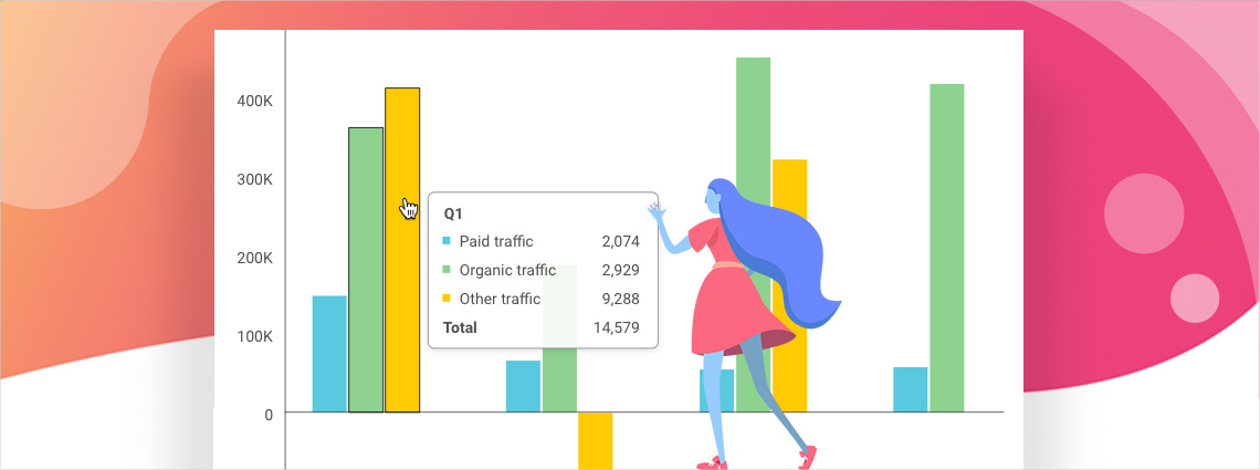
- Chame a atenção para os principais pontos de dados com formatação condicional. Defina limites que se correlacionem com variações em seus dados.
- Com anotações de gráficos, você pode apoiar sua narrativa de dados em um gráfico ou com colaboração. As anotações fornecem aos seus usuários insights mais profundos do que os pontos de dados.
- Use a detecção de outliers para destacar rapidamente anomalias ou desvios em um conjunto de dados.
- Use previsões de séries temporaispara fazer previsões para pontos de dados futuros com base em dados passados e presentes, fornecendo aos seus usuários análises preditivas. A regressão linear
- permite que você trace tendências entre variáveis dependentes e independentes. Use a regressão linear quando quiser mostrar a linha de "melhor ajuste" para corresponder (prever) a tendência geral nos dados. 9. Use Interações Eficazes
Os modernos programas de análise de dados
tornam fácil criar interações para permitir que os usuários segmentem e analisem dados para obter insights mais profundos sobre as perguntas que desejam responder. Algumas das interações mais eficazes incluem:
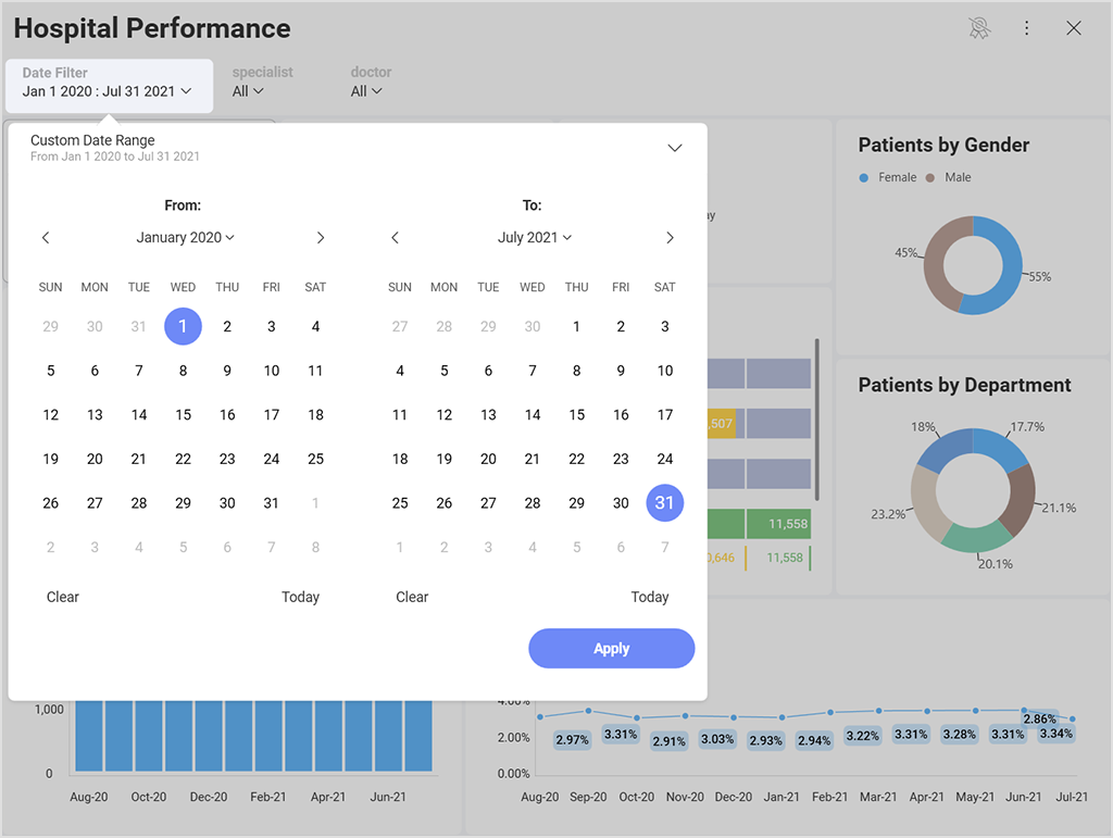
Filtragem dinâmica
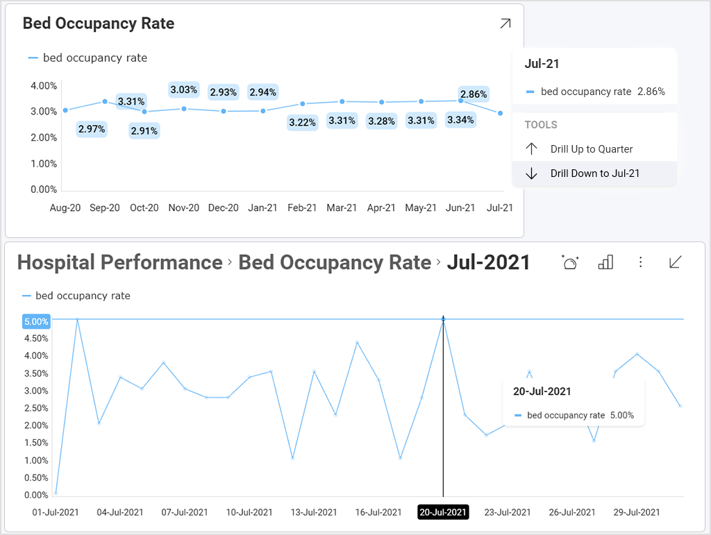
– adicionar filtros ao seu painel ou visualização permite que você ajuste seus dados dinamicamente para obter insights mais profundos. Forneça diferentes opções para que seus usuários segmentem e analisem dados por campos de categoria ou intervalos de datas, seja no nível do painel ou da visualização. Drill-down
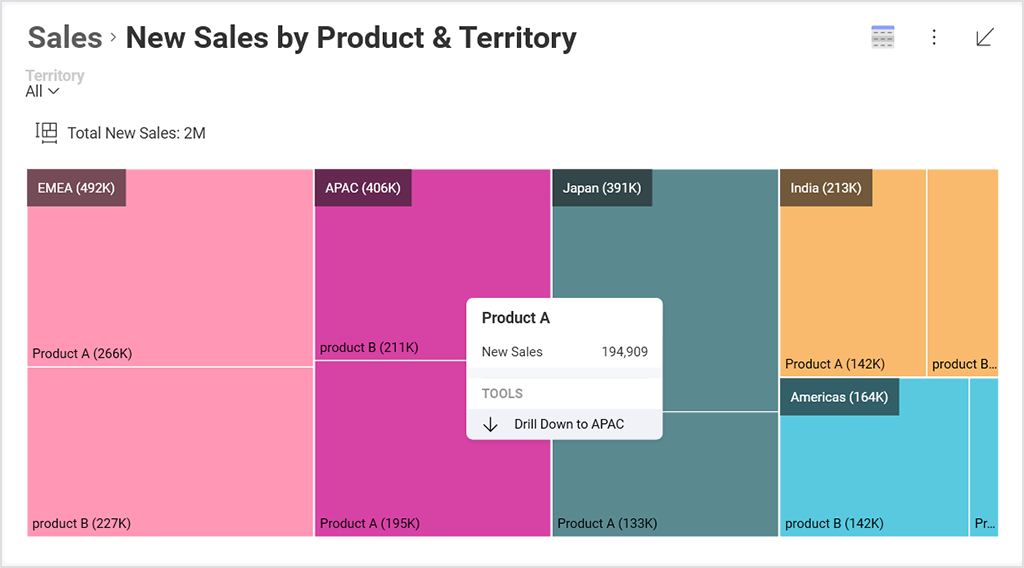
– habilitar hierarquias em seus campos de categoria ou data permite que seus usuários finais façam análises mais aprofundadas. Treemaps
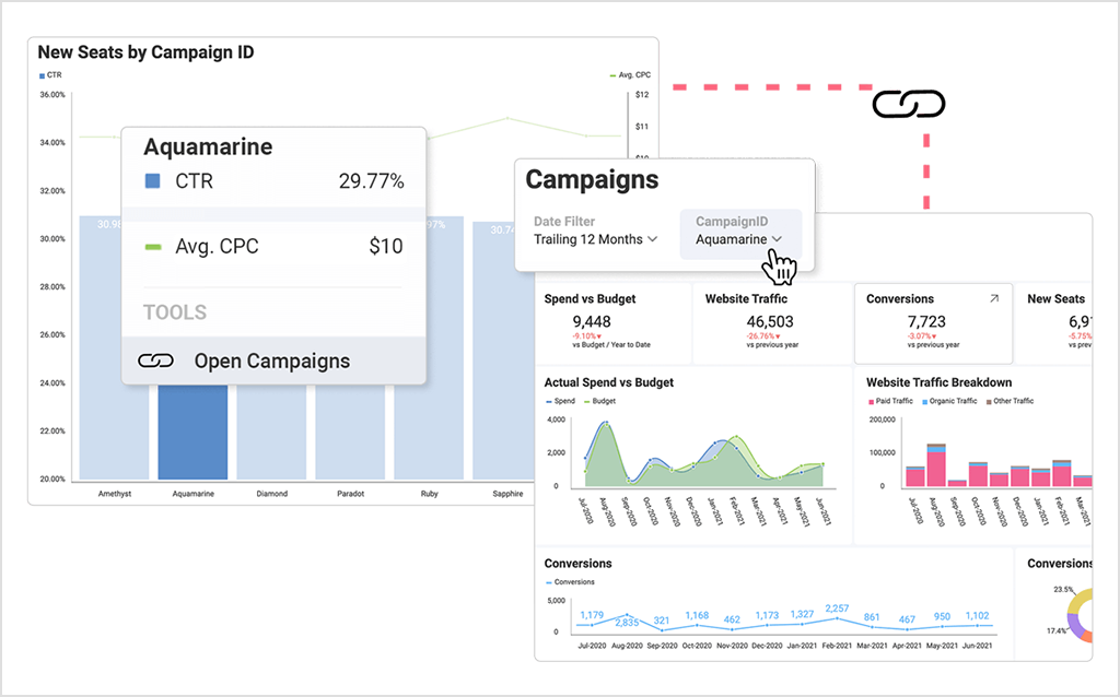
treemaps– são excelentes visualizações para drill-downs, pois exibem grandes quantidades de dados hierárquicos em um espaço compacto de forma rápida e mostram os dados como parte de um todo. Vinculação de painel
– vincule pontos de dados ou visualizações a outros painéis. 10. Dobre suas Margens
Os espaços em branco, também conhecidos como espaços negativos, são as margens notáveis entre as métricas em seu painel. A história dos dados se torna difícil de ler se esse espaço em branco, negativo, não estiver equilibrado.
Salvar esta área entre os gráficos e elementos do seu painel fará com que ele pareça mais amplo e menos avassalador. Você pode usar diferentes visualizações e filtros de dados para dobrar suas margens e tornar possível exibir todas as informações na mesma tela.
11. Use a Escala Correta
A escala de um eixo de gráfico pode afetar significativamente a forma como um público interpreta uma mensagem dentro da história dos dados e é uma parte importante da otimização
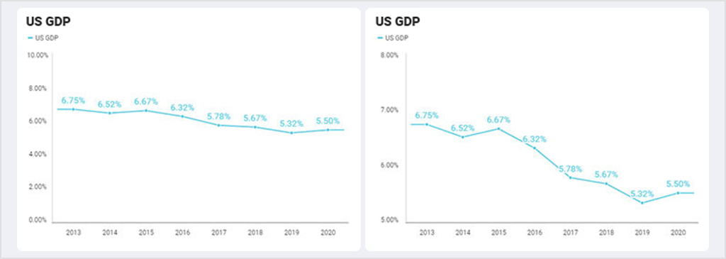
A melhor maneira de evitar ser acusado de criar visualizações enganosas é evitar alterar a escala do eixo Y. Isso tende a contar uma história diferente da que os dados deveriam. visualização de dados.
Aqui está apenas um exemplo de como um gráfico conta uma história incorreta. Ambos os gráficos mostram os mesmos dados. No entanto, o gráfico da direita tem o eixo começando em 5%, fazendo com que pareça que o PIB dos EUA está despencando. Enquanto, quando você olha para o gráfico da esquerda, na verdade, há apenas um pequeno declínio gradual.
12. Preste Atenção aos Detalhes
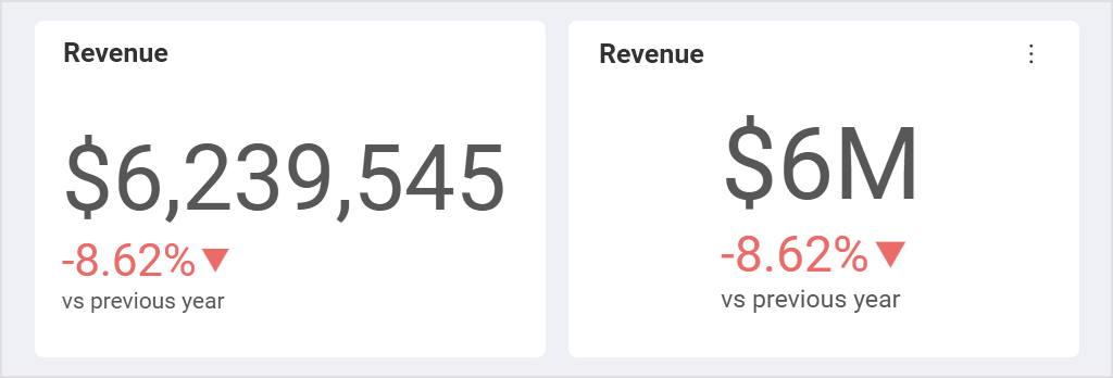
Às vezes, os detalhes podem aprimorar a UI/UX do seu painel, mas, em outros momentos, o excesso de detalhes confunde sua mensagem. Por exemplo, manter seus números formatados ou filtrar os principais resultados torna os dados mais fáceis de ler.
Formatar seus dados pode ser uma maneira rápida e simples de tornar os números mais atraentes visualmente e mais fáceis de ler para um usuário final. Para medidores ou gráficos, como gráficos de barras e gráficos de colunas, você pode ajustar a formatação dos seus dados para destacar seus pontos de dados: limitar o número de casas decimais, por exemplo, ou ajustar o posicionamento dos separadores de vírgula. Além disso, considere usar formatação de moeda, porcentagem ou números grandes.
Você provavelmente já ouviu falar de análises incorporadas e da crescente demanda por insights de business intelligence derivados delas. Uma pesquisa recente da
Como criar uma excelente UI para um painel usando análises incorporadas?
Reveal mostrou que as plataformas de análises incorporadas estão crescendo em popularidade por sua capacidade de tomar decisões baseadas em dados, obter uma vantagem competitiva e impulsionar as vendas – com 58% dos entrevistados incorporando análises em seus aplicativos para seu próprio uso em 2022, em comparação com 33% em 2021. O principal motivo para isso é que as plataformas de análises incorporadas melhoram as decisões de negócios por meio de painéis de controle de alto impacto. As análises incorporadas trazem visualizações e painéis de dados interativos e em tempo real, e recursos de business intelligence diretamente para o fluxo de trabalho dos usuários – criando dados contextuais que melhoram a usabilidade dos dados para os usuários de negócios.
Fornecer aos usuários insights relevantes e oportunos em seu fluxo de trabalho promove uma cultura orientada a dados e incentiva um pensamento mais analítico. As análises no contexto permitirão que seus usuários tomem decisões mais rápidas e inteligentes com base nas informações disponíveis naquele momento ou visíveis na tela específica que estão visualizando.
Além disso, uma
boa solução de análises incorporadas vem com recursos de autoatendimento que fornecem uma UI intuitiva, tornando a interação com os dados mais acessível para aqueles que não têm conhecimento técnico. Com recursos de autoatendimento, os usuários podem acessar e analisar dados de forma independente e criar painéis e relatórios informativos e de alto impacto. Reveal é uma solução de análises incorporadas de autoatendimento de ponta a ponta que traz o poder dos dados para as mãos de seus funcionários, clientes, parceiros e fornecedores. No seu cerne, Reveal é centrada na tomada de decisões baseada em dados e foi projetada para permitir que você integre facilmente painéis interativos e visualizações de dados,
, análises avançadas e preditivas, incluindo aprendizado de máquina, previsão, funções estatísticas e muito mais em seus aplicativos, para que seus usuários possam acessar insights em tempo real e criar painéis bonitos e informativos em qualquer lugar e em qualquer dispositivo. A marca branca permite personalizar todas as partes da solução de análise para corresponder ao tema da sua marca. Quando o aplicativo analítico parece fazer parte do seu sistema, os usuários não se distrairão ou notarão uma diferença em seu aplicativo, mas se tornarão clientes mais leais e satisfeitos por causa do valor adicional que você está oferecendo.Você pode saber mais sobre Reveal e como ela funciona acessando
Crie Modelos de Painel Eficazes com Facilidade agendando uma demonstração rápida ou Tome decisões baseadas em dados.
Aproveite o poder dos dados
Desenvolva sua empresa com dados contextuais e em tempo real.